
.png)
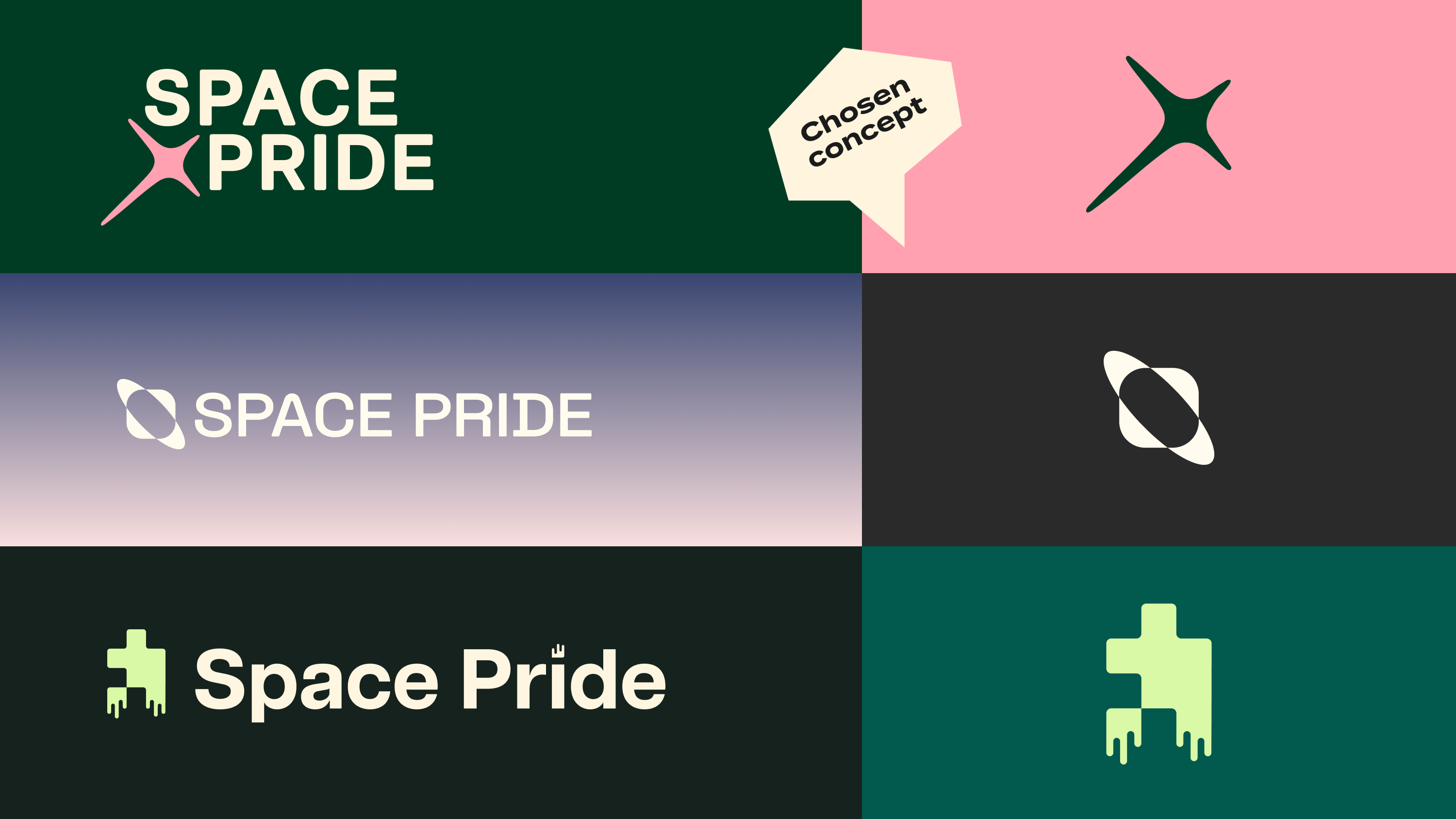
Space Pride
“Our brand needs to reflect what we actually stand for.”
“Sounds like you need a revamp to match your vision.”
The problem:
Space Pride had a powerful mission but an identity that was no longer resonating. Their brand needed to unite a global community, champion LGBTQIA+ journeys in the space sector, and hold its own in rooms where representation still lags behind. Something confident, modern, and instantly meaningful.
The solution:
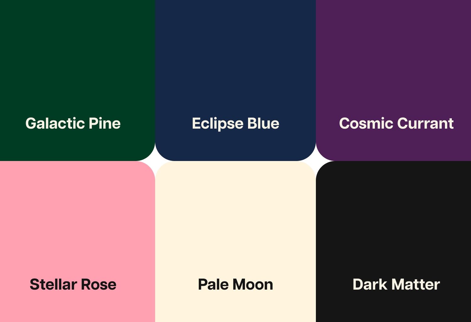
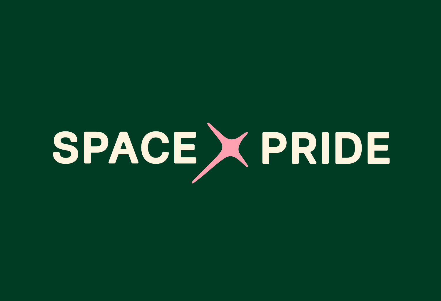
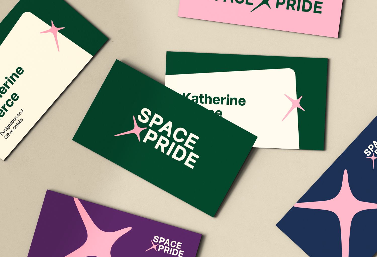
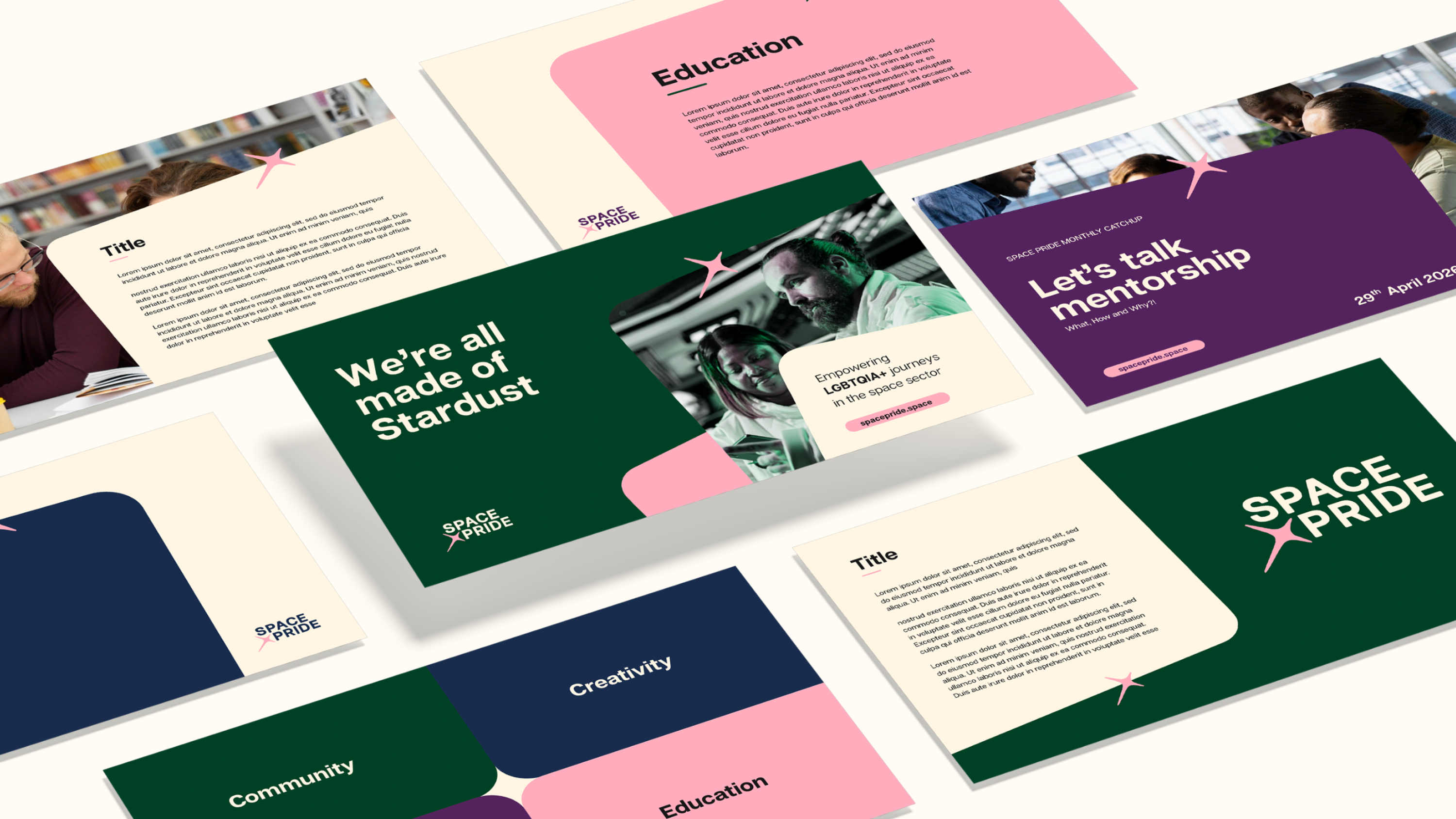
We built a new visual world for Space Pride from scratch, one rooted in inclusivity and energy. We centred the rebrand around the Stardust mark, a symbol inspired by the idea that we are all made of the same cosmic matter. The new visual language brings that message to life through bold colour, expressive shapes, and a digital-first system designed to scale. The result is a vibrant identity that celebrates who they are and will match their growth.
The process:
We collaborated with Space Pride every step of the way, focusing on a cohesive message across all platforms. We worked with their team to ensure every touchpoint, from socials, to events, to their website, meets accessibility criteria and amplifies Space Pride’s voice and purpose.

Some humble brags

.png)
%20(1).png)
Some humble brags
Not what you’re looking for?
We’ve got lots of top-secret client projects under our belt, and we can’t talk about all of them here. If you can’t find the perfect case study, get in touch. We can take you through our relevant experience for whatever project you have in mind.
Similar projects

Impulse


Go on… steal all of our brilliant ideas
Fancy some emails you’ll actually want to read? Sign up for our newsletter and we’ll slide into your inbox with insights on how you can make your brand hotter than Dante's inferno.