

Bubble
What they said: “We need packaging that feels high-end yet affordable, ready for expansion into Asia and Australasia.”
What we said: “You had us at expansion!”
The problem:
Bubble wanted to break into new markets, delivering children’s toys that were budget-friendly but still had a premium feel. Their challenge was designing packaging that appealed to young parents in Asia and Australasia while staying true to their high-quality, Western-inspired branding. Beyond the creative challenge, the project also required strategic thinking. Their team in Hong Kong needed clear, adaptable packaging guidelines to ensure consistency across different formats and languages. The design had to be flexible enough to work across boxes, hang tags, and backing cards, all while maintaining the same playful, high-end feel.
The solution:
We developed a fresh, fun, and modern packaging concept inspired by Scandinavian design, combining clean lines, soft colours, and minimalist aesthetics to make Bubble’s toys instantly appealing to parents. The new look struck the perfect balance between affordability and a high-end feel, helping the brand stand out in its new markets. To ensure smooth implementation, we created technical packaging guidelines tailored for Bubble’s team in Hong Kong. These guidelines detailed how the designs should be applied across different packaging formats, making sure every box, tag, and card retained the same polished look. With teams speaking multiple languages, clarity was key, so we structured the guide to be straightforward, concise, and universally easy to follow.
The process:
We began by analysing the market and identifying key design trends that would resonate with young parents in Asia and Australasia. Using these insights, we crafted a Scandinavian-inspired packaging concept that blended simplicity with warmth, making the products feel premium yet accessible. Once the creative direction was locked in, we shifted focus to implementation. We worked closely with Bubble’s Hong Kong team, developing a set of detailed yet easy-to-follow technical guidelines. These outlined how the packaging should be adapted for various formats, ensuring consistency across all product lines while accommodating different shapes, sizes, and language requirements. The result was a distinctive, high-end packaging identity that not only stood out on shelves but was also scalable across multiple formats and markets. Bubble now had a strong visual foundation to support their international expansion while keeping their brand cohesive and recognisable.

Some humble brags
From the very beginning, Annie and her team understood exactly what the Bubble brand stands for, and translated that vision into packaging that engaged both our retailers and customers. I AM FEMALE’s design work has completely elevated Bubble's in-store presence. The clean, modern aesthetic makes each product look like a gift waiting to be unwrapped. Customers love how easy it is to understand the features and age suitability at a glance, and the consistency across our entire range gives our brand a polished, premium feel. In addition to designing great packaging, Annie and her team were a joy to work with – we couldn’t have asked for a more collaborative, creative and professional team to partner with on this project. We have continued to defer to them for all our big design projects!
Victoria Thomas, Global Head of B&G Brands


Some humble brags
Not what you’re looking for?
We’ve got lots of top-secret client projects under our belt, and we can’t talk about all of them here. If you can’t find the perfect case study, get in touch. We can take you through our relevant experience for whatever project you have in mind.
Similar projects

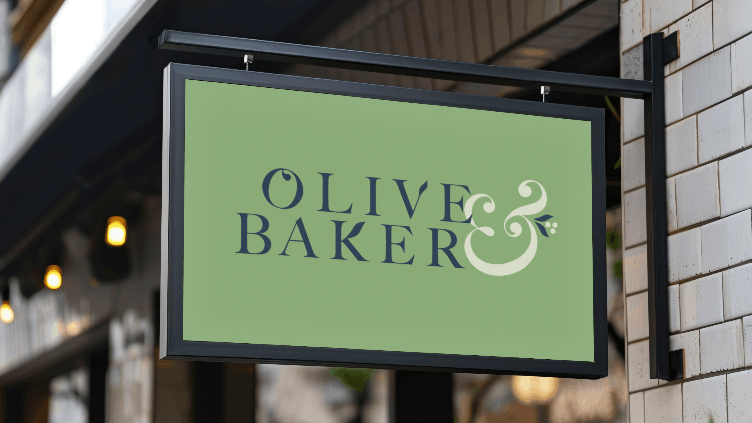
Aviela


.png)


Go on… steal all of our brilliant ideas
Fancy some emails you’ll actually want to read? Sign up for our newsletter and we’ll slide into your inbox with insights on how you can make your brand hotter than Dante's inferno.