
.png)
Packaging Design Trends 2026: The Ones Worth Following
In 2026, we’re seeing more packaging design trends that are fun, creative, and aesthetically Instagrammable. But behind the looks, what do these designs say about your brand, and how do they speak to your audience?
Packaging influences purchases. Customers are more likely to choose a product they’re aesthetically drawn to, but beyond the initial shelf appeal, what is it that makes them buy again (and again) from you? Obviously, the product, but the packaging needs to do more than just look pretty. It’s one of the most physical and permanent parts of your brand; it needs to represent what you stand for.
This means your product packaging design has to back up your campaign messaging and your values. We’ve talked about authenticity a lot; how your audience (especially Gen Z) will spot performative marketing and judge, or even cancel you, for it. The same applies to packaging. Packaging trends are only worth it if they’re connected to your brand, and while the most creative brands can apply trends to their niche, this needs to be done well. Slapping a design on your product that has no cohesive connection to your brand can affect your audience’s perception of authenticity, and even their loyalty.
2026 packaging design trends you should know about
In 2026, aesthetic is everything. Maximalism is in, with bold colours and designs that steal a second look from customers, while minimalism is evolving. Finally, millennial gray is on the way to its grave, being replaced by soft edges and colour palettes. The Dieline's 2026 trend report points to research showing our brains prefer round shapes, as they see them as warmer and safer. Brands are reflecting this in packaging with rounded corners and panels, pill-shaped bottles, and layouts built on curves.


Metals are everywhere, from chrome and metallic finishes to brushed steel that give products a premium, engineered appearance. On the opposite side, hand-drawn analogue designs are screaming f*ck you to the AI-slop era. Hand-crafted looks with intentional imperfections show a person made this, with care and personality. We love this creative approach, but again, it only works if it reflects your brand.


Vintage never goes out of style, and we’re seeing packaging with heritage revival, retro motifs, muted palettes and warm serif typography. Foil accents, embossing, letterpress, matte finish, uncoated stock and kraft paper finishes are pulling customers in with a warm feeling of nostalgia. Illustrations, character-led design, caricatures, and even glow-in-the-dark packaging are all adding personality to product shelves.

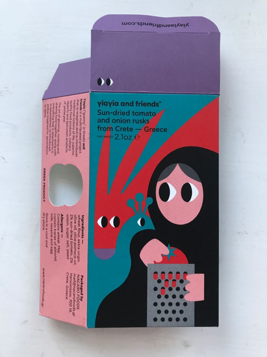
Technology can now make your products come to life. Smart packaging, interactive packaging and connected packaging are becoming more popular, and augmented reality is at the scan of a QR code. For e-commerce and DTC brands especially, this can create an interactive unboxing experience that engages your audience.
Chaos packaging; designed to confuse
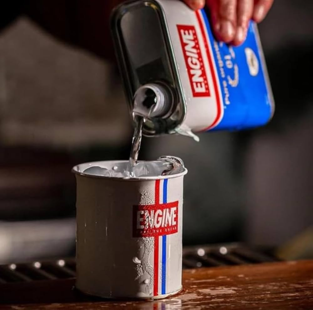
One of the biggest trends this year is chaos packaging: putting a product in a format you’d normally find with something else. Gin in a motor oil tin, coffee in a tube, olive oil in a squeezable condiment bottle, electrolytes in a soap dispenser. It makes people pause when they see it on a shelf, something short circuits in the association shortcut we’ve built in our brain, and we stop to figure it out.
This is not a new tactic: The Leggs pantyhose egg from the 1960s was doing this before it had a name. What’s different now is the social media documentation; people like and respond to things that are unexpected and creative, they have the potential to go viral, and achieve free, organic reach. Chaos packaging isn’t for every brand, but the ones really killing it also have a practical reason behind the product design. Graza’s olive oil squeezy bottle is fun to look at but is also lighter to ship and easier to pour, and NoNormal Coffee targets hikers and campers who want good coffee but don’t want to trek up a mountain with a Moka pot on their back.
It’s important that the packaging doesn’t turn into a gimmick. Packaging Europe notes that the most powerful packaging innovations come not from shock but from rethinking category norms strategically. Chaos works when it serves the product, the customer and the planet. The confusion can’t put customers in danger either – no bleach in a juice bottle or pills in sweet wrappers.
One of our favourite examples is Flo, a company that’s challenging the period care industry with organic cotton tampons. Their products come in sustainable ice cream tubs – good for the environment and a playful nod to period cravings, while aligning with the brand’s mission to normalise period care.


Design aspects that aren’t trends
In 2026, sustainable packaging should be a non-negotiable. Extended producer responsibility (EPR), is changing the economics of FMCG packaging design and CPG packaging across markets. Hard-to-recycle formats are now more expensive to make, so new materials are commercially and ethically advantageous. Brands are favouring mono-material and single-material designs, fibre-based structures, recyclable and compostable formats, biodegradable and bio-based materials like PLA, mushroom packaging, seaweed films, and more recycled materials for a push towards plastic-free and lower carbon emissions.
These changes are on the right track, but research suggests brands still need to do more. A 2025 Systemiq and Eunomia report found that in healthcare and over-the-counter packaging alone, plastic waste, emissions and costs could climb 35 to 40% by 2040, while circular approaches could cut plastic use by up to 53%.
Consumers and regulators are both getting sharper on greenwashing, so if you’re making a sustainability claim (and you should be!), make sure it’s backed up by your values and actions.
Accessible packaging is often overlooked, but it is one of the most important things to consider. Accessibility should be considered at every stage of design; from the first sketch to the final production sign-off. Inclusive packaging and universal design mean thinking about ergonomic grips, opening force, braille, and hyperlegible typography for people with low vision. If the people buying your product can’t access it, they’re not going to buy it again.
Cultural references are trending, but not always for the right reasons. Regional motifs, heritage typography, folk illustration, packaging that feels rooted in a specific place. Done right, it’s a beautiful way to showcase a brand’s heritage, but if your brand doesn’t have or co-create with said heritage, you’re going to alienate, and likely offend, your audience.
If your product relates to a specific heritage or culture, but you don’t, you need to do your research. Make sure your references are authentic, representative, and definitely not offensive, and co-create with the community. If there’s no connection between your brand and this culture, then don’t bother. Cultural appropriation is not cute, and will not win you customers.
We talk about this more in our piece on why most brands get cultural branding wrong.
You can't design packaging for people you never talk to
Talking about co-creating, you cannot design good packaging for a community you're not actually working with. If you’re an all-male decision-making team, you are not going to create effective products or packaging for women without involving them in the process. Brands that have never sat in the room with the audience they’re creating with at best fall flat and at worst insult their entire customer base.
This applies to categories like women's health, femtech, sexual wellness, and LGBTQIA+. Packaging in these spaces often requires more than the mainstream trend lists mention. Avoiding stereotypes, dignity, discretion, and not treating your audience like children or idiots are all good places to start, alongside involving the people you are creating for. Flo’s period ice cream tubs work because the founder is a woman, and they work with and understand their audience.
Co-creating with your audience builds brand loyalty, authenticity, and helps brands question their biases and rethink the norm to create something better and bolder. We wrote more about this in our blog post on how to think queerer. And this doesn’t just apply to queer brands or products, but to anyone who wants to be less basic.
Make sure your packaging says something beyond the trend
If a client comes to us asking for the latest design trend, we always ask why. We want to know if it serves your brand and your customer, or if it's because you saw it somewhere and it looked cool. Chasing trends can work for social media, but sticking it on your very permanent packaging without a purpose is an expensive way to put off your customers.
We work with brands to create packaging that’s unmistakenly them; that reflects their personality and their values long beyond any trend’s lifespan. We’ve partnered with Bed Head since 2016, and helped them rebrand a recent product line. We created a new range of packaging, alongside a design strategy to ensure customers picked their products off the shelves, including 2D and 3D packaging design and graphic concepts. We liaised with production experts on colour accuracy, print functionality, and pack structure, and we built out a design strategy the team could carry into the years ahead. You can read the full Bed Head case study here.
Design trends can be a fun and creative way to express your brand’s personality, but make sure your packaging design goes beyond just the trend. Think about your brand, product, values, and customers before you start picking out aesthetics.
At I Am Female*, we build packaging with strategy. We understand and co-create with the communities we’re designing for, and we know the importance of authenticity throughout every stage of the packaging process. For any design queries or packaging problems, we’d love to help.
Book a call with us and learn how your packaging can end up in your customers’ baskets, time and time again.


Go on… steal all of our brilliant ideas


Go on… steal all of our brilliant ideas
Fancy some emails you’ll actually want to read? Sign up for our newsletter and we’ll slide into your inbox with insights on how you can make your brand hotter than Dante's inferno.